| |
Yield Map Interpretation | |
| |
|
|
| |
|
|
| |

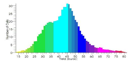
The yield map above is from a 1997 wheat crop in a 200 acre field in south-central Alberta. The yield map was produced using a yield monitor (yield data each second) combined with a differential global positioning system (DGPS). The distribution of yield levels are presented in the histogram below. A number of features of yield map interpretation are labelled here with explanations on the back of this page.
The field on the reverse is a clay loam soil and has been direct seeded for about 20 years. It lies on strongly rolling topography with uplands on the east and south. These drop sharply with 25 % slopes to the centre of the field. The elevation difference is about 35 m. The white circular feature in the northwest corner (A) is an uncropped slough.
The yield measurements are represented as rectangularly shaped picture elements or pixels. They represent a width of about 18 m (60 ft), as the field was harvested with two 9 m wide combines (30 ft header), only one of which had a yield monitor equipped with DGPS. The field was straight-cut. Yield monitor readings are recorded every second, thus the length between yield monitor readings is approximately 1.6 m. Yields range from a low of 10 bu/ac (yellow) to a high of 70 bu/ac (red). The yield histogram shows that not much of the field yielded as low as 10 or as high as 70 bu/ac, but rather, that most of the field yielded between 32 and 52 with an average of 45 bu/ac. However, there a number of reasons why care must be taken in interpreting mapped values.
The map presented here do not represent "raw" yield data. Most of the yield measurements have been "cleaned" for some of the reasons outlined below, although remnants of the original problems remain visible in the map. The data have also been smoothed minimally, using the average value between each yield and its two nearest neighbours.
False high readings (B) occur when a plug goes though the combine or if the combine stops moving forward and the crop that it has harvested continues to be threshed. Since the yield monitor calculates yield as the amount of crop (bu) per distance travelled (ac), the falsely high yield results because the distance "travelled" is very small when the combine has stopped or nearly stopped, but the crop flow continues at the regular rate. It is important to recognize what can occur when combine speeds vary across a field. False low readings are found at over-travelled areas where the combine has already harvested the crop. These can often be found at field perimeters or headlands and at the corner diagonals (C) when a field is harvested in a rectangular pattern. In our example, the field was harvested in a clock-wise rectangular pattern, including the fan-shape (D) that occurs as the combine circled around the bottom half of the slough (A).
Linear features on yield maps should alert the interpreter to the possibility of mechanical or management influences. A subtle example of a linear man-made feature is a high-yielding old fence line, shown at (F). This feature has been more evident in previous years of yield monitoring, and is related to more recent cultivation and wind erosion deposition along the old fenceline. When interpreting yield maps it is important to consider the effects of past management history, such as portions of fields that were managed differently or non-uniform management (e.g. manure spreading patterns).
Zig-zag or zipper features on the map (G) are due to variable lag times between when a crop is cut and when it registers on the yield monitor. Even after a correction for the "average time lag" of 16 seconds, the position of the yield measurement can be mis-located by up to 20 m. Side-by-side measurements can be mis-located by up to 40 m when adjacent rounds are harvested in opposite directions. Cautious interpretation of areas less than 40 m in size is recommended.
Yield histogram
The shape of the yield data histogram (frequency distribution of the classed yield data) on the lower half of the opposite page can give hints as to how the yield data should be classed. It is currently classed into one bushel continuous-colour classes in order to see the small and sharp differences. If software capabilities exist class divisions could be set at 30, 40 and 50 bu/ac. These appear to be natural breaks in the shape of the histogram. Watching where those areas exist in the whole field may may indicate where within-field changes in management would be appropriate. Follow up with area-specific diagnostics, (e.g. soil sampling) to determine the most appropriate management change.
Remember, keep in mind the weather for the growing season, crop type sensitivities to soil properties or weather, variations in soil properties and field history should all be considered when interpreting yield maps.
This information is provided by Sheilah Nolan , and Tom Goddard |
|
| |
|
|
| |
For more information about the content of this document, contact Sheilah Nolan.
This document is maintained by Laura Thygesen.
This information published to the web on October 17, 2001.
Last Reviewed/Revised on July 4, 2018.
|
|